Designing a clearer customer success dashboard
An internal IBM tool that helps Customer Success Managers keep track of client subscriptions and understand how customers are using IBM products. I worked on turning messy, complex data into clear, useful insights that make it easier for CSMs to build stronger relationships with clients.

Overview
IBM CustomerSuccess360 was built to replace an outdated legacy tool that left customer success managers struggling to track down key customer data across a fragmented experience.
As the lead designer, I partnered with stakeholders, product managers, and engineers to rethink the user experience. I was responsible for creating a clean, modern UI that brought together siloed data sources and made it easier for teams to monitor and act on key customer metrics.
The redesigned experience gave customer success managers a clear, unified view of their accounts, helping to spot risks faster and reduce churn.
MY ROLE
Lead UX Designer
Front-end developer
TEAM
Design
Product Owner
Development
TIME ON PROJECT
2019 - 2023
QUICK LINKS
Context
Starting point
Users were relying on an outdated system with fragmented data. Accessing accurate customer subscription information was time-consuming, and these delays often led to customers being notified too late about overages, resulting in surprise charges, contract terminations, and poor customer experiences.
Goals
Reduce Churn
Prevent contract terminations by improving partner relationships.
Increase Efficiency
Pair contract details with usage metrics for quicker understanding of offering usage.
Provide forecasting
Use prediction models to indicate expansion or churn.
Research
Through user interviews with CSMs, I learned that their biggest challenge was how disconnected the data felt. They spent too much time switching between systems just to piece together customer subscriptions, usage, and adoption metrics. This fragmented process slowed them down and made it hard to spot risks or opportunities. From these insights, it became clear that their success depends on having a unified view of customer health.
User Flow
From the start, CS360 was designed to give Customer Success Managers a clear view of their clients’ subscriptions along with a Customer Health Index (CHI) Scorecard that shows how each account is performing. A typical user journey starts with searching or browsing customer subscriptions, then diving into key details and the CHI score to get a sense of overall engagement. The flow below shows what that experience looks like:

Solutions
Subscription list
I designed a subscription list page that makes it easier for CSMs to search, filter, and quickly spot subscriptions that need attention. Each result surfaces key details at a glance, while the filters panel helps refines results by CHI score, renewal date, contract value, and more. This brought clarity to what used to be a complex search process.
Subscription detail
We introduced a comprehensive customer subscription page that displays a detailed entitlement list paired with customer usage metrics. Some subscription pages also offered customer health insights that predicted a customer’s future usage pattern based on previous usage patterns.
Data visualization explorations
Every use case brought its own challenge, so I explored different ways to visualize the data. Some charts needed to handle large data sets, while others focused on highlighting when a customer’s usage went beyond their contract entitlements. I also focused on how to best display contract entitlement data to complement the charts, so users could immediately understand what they were looking at. The goal was to make complex information easy to understand at a glance and actionable for CSMs.
Partner page
We eventually expanded the app to monitor subscriptions for IBM partners. Users gained insights into consumption and subscription data for offerings used by IBM partners.
Reflection
The feedback from customer success managers was super positive. They finally had a tool that gave them a clear, at-a-glance view of their accounts. It helped them walk into customer conversations more prepared and better able to offer support that actually made a difference.
By giving CSMs the insights they needed, the tool helped reduce churn. Teams could spot red flags earlier, focus on the right customers, and build stronger relationships. Overall, it made their jobs easier and more impactful, and that’s exactly what we set out to do.
More case studies
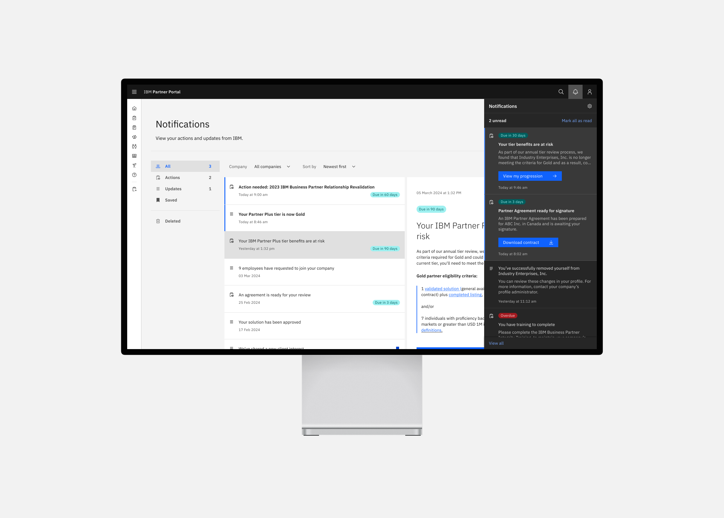
IBM Partner Portal Notifications
Bringing clarity to a noisy enterprise notification system

IBM Partner Plus Relationship Revalidation
Simplifying a complex revalidation workflow for partners
Design projects

Designing a sleek, user-friendly shoe shopping experience

Helping users plan and organize grocery trips

Simplifying project planning with a collaborative roadmap